AC SERVICE WORLD — Home Services Website UX/UI Case Study
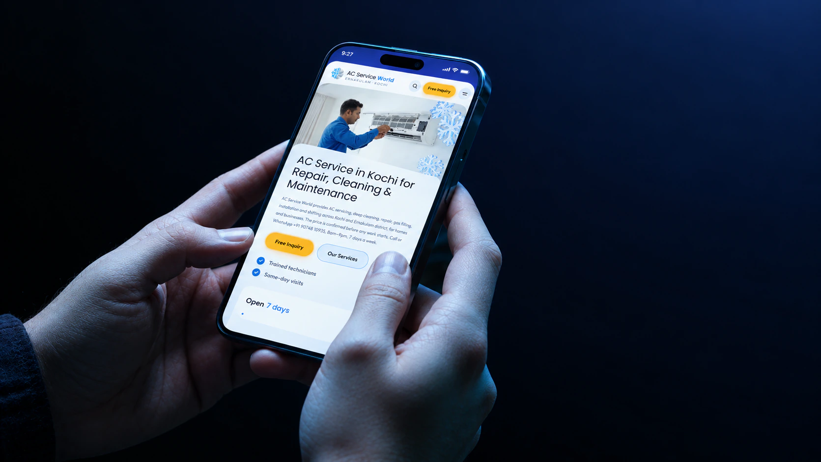
AC Service World is an air-conditioning service website redesigned by S. Vysak in 2026 as a responsive UX/UI project, focused on clearer service discovery, transparent information, customer trust and an easier path from a problem to a service enquiry.
- Role
- UX/UI Design
- Timeline
- 2026 · 3 months
- Sector
- Home Services / Air Conditioning
- Year
- 2026
Problem & context
Air-conditioning services often become urgent when an AC stops cooling, needs maintenance or needs repair. Customers want to know which service they need, roughly what it will cost and how quickly they can get help. AC Service World already presents several service categories and ways to get in touch, but those pieces were not joined into one intuitive journey.
The brief was a website UX/UI redesign that turns a service-focused site into a clear, trustworthy and conversion-oriented experience, working across desktop, tablet and mobile. The business goals were to increase qualified service enquiries, make service categories easier to find, build trust through transparent information, improve mobile usability and contact access, and reduce friction between discovery and enquiry.
Process & key decisions
The redesign started from four design hypotheses drawn from the service context and an initial review of the website. They are working assumptions, not validated user-research findings.
Clarity builds confidence: plain-language service descriptions with clear inclusions. Price uncertainty creates hesitation: verified prices, or a clear explanation of how quotations are given. Trust influences service selection, because customers are inviting a professional into their home: genuine reviews, verified business details, clear service policies and authentic imagery. Mobile contact must be effortless: call and message actions kept visible and easy to reach on small screens.
I used ChatGPT, Gemini and Claude Code alongside Figma and FigJam to explore the information hierarchy, service discovery, booking journey and mobile layouts. The full case study, with the research insights and screens, is on Dribbble.
Outcome
- Service categories organised for easier discovery.
- Plain-language service information and transparent pricing guidance to reduce hesitation.
- Trust signals built into the journey: reviews, business details, service policies and real imagery.
- Call and message actions kept visible on mobile for faster enquiries.
Project visuals
Related case studies
- 2026 · E-commerce / StreetwearVOID XE-Commerce / Streetwear
- 2026 · E-commerce / ToysBLASTOYSE-Commerce / Toys
- 2025 · MarketplaceOLAMOUMarketplace
Work with S. Vysak
This project was designed by S. Vysak, a UX/UI and product designer based in Kochi, India. Browse more case studies, see the tools behind the work, or get in touch about a project.